Underappreciated CSS features by example
A quick exploration of a handful of underappreciated CSS features. I've tried to choose practical examples where possible to demonstrate each feature's full capabilities.
My examples will use SASS for the beautiful syntax, with Bourbon for vendor prefixing and shortcut methods, and Ruby, my German Shepherd, as a model.
Keyframe animations
Keyframe animations are a powerful way of animating DOM elements. You declare an animation using @keyframes <name>, and then apply it by adding animation-name: <name> to the element you'd like to animate.
One of the simplest examples is to continously spin, which I use for loading icons instead of a GIF:
+keyframes(spin)
  0%
    +transform(rotate(0))
  100%
    +transform(rotate(360deg))

.spin
  +animation(spin 1s infinite linear)
For example:
For Biosgraphy I built a flipping effect for the loading butterfly, which uses CSS transforms with perspective to flip horizontally.
+keyframes(flip)
  0%
    +transform(perspective(400px) translateZ(0) rotateY(0) scale(1))
    +animation-timing-function(ease-out)

  40%
    +transform(perspective(400px) translateZ(150px) rotateY(170deg) scale(1))
    +animation-timing-function(ease-out)

  50%
    +transform(perspective(400px) translateZ(150px) rotateY(190deg) scale(1))
    +animation-timing-function(ease-in)

  80%
    +transform(perspective(400px) translateZ(0) rotateY(360deg) scale(.95))
    +animation-timing-function(ease-in)

  100%
    +transform(perspective(400px) translateZ(0) rotateY(360deg) scale(1))
    +animation-timing-function(ease-in)
For example:
You can trigger Javascript events when your CSS animation has finished, allowing you to chain events. For example, you could animate the close of a modal - get the modal div, add an event listener to remove the element from the DOM, then add a 'fadeOut' class.
e = document.getElementById("spinner")
e.addEventListener("animationend", on_end, false)
e.className = "icon-spin"
There are also the aptly named "animationstart" and "animationiteration" events, which are triggered on the animation start and on each iteration.
Filters
Filters let you apply an effect to an element (usually an image), for example, converting to grayscale:
filter: grayscale(50%)

You can chain multiple filters together, and/or apply them with a CSS animation (or via a transition), for example:
+keyframes(brightness)
  0%
    +filter(brightness(100%))
  100%
    +filter(brightness(200%))

.filters
  +animation(brightness 3s linear 0s infinite alternate)

Box reflection - webkit only
Box reflection is only supported in webkit (Chrome and Safari). It looks like element (coming in CSS4) will be the recommended method of doing box reflections (albeit with more HTML elements) for production sites in the future.
You can recreate the classic photo-gallery effect like so:
-webkit-box-reflect: below 2px linear-gradient(transparent, transparent 50%, rgba(255, 255, 255, 0.4))

Font features
Some OpenType fonts allow for advanced control over typographic features. I'm using Playfair Display from Brick.
You can control ligatures (combining several letters into a single specifically designed glyph), numbers (oldstyle, proportional), automatic fractions, swashes, and more. See the full list of four letter codes.
Ligatures
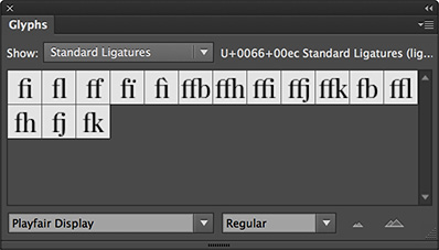
The Glyphs panel in Illustrator is useful for viewing all the ligatures that a font supports:


Common ligatures (liga)
+font-feature-settings("liga" on)
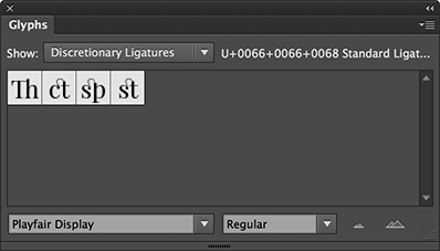
Discretionary ligatures (dlig)
Numbers
Oldstyle figures (onum) vs lining (lnum)
Automatic fractions (frac)
Kerning (kern)
Slight adjustments in kerning between glyph combinations (e.g. "To") - above is with kern on, below is the default behaviour.
Ellipsis
Automatic ellipsis of single-line text in a width-constrained container.
text-overflow: ellipsis
white-space: nowrap // don't wrap
overflow: hidden // don't scroll
width: 50% // or max-width
Hyphens
Adjust hyphenation, rather than relying on the browser's default behaviour. Not currently supported in Chrome, Opera or Android browser - see the firefox screenshot.
+hyphens(manual) // auto or none
hyphenation hyphen­ation
You can force no hyphenation with none so long words get wrapped:
Rely on the browser to hyphenate appropriately with auto. You can suggest places with ­ characters, but the browser may do it's own thing.
Or reply on manual hyphenation completely, only at ­ characters.